


How to Choose Art for Your Home: A Designer’s Guide to Getting it Right
The best way to choose art for your home is to start with scale, architecture, and sightlines before you think about colour or emotion. In luxury homes, the right artwork should support the room, not just fill a blank wall. Most people leave art until the end of a renovation. They’ve made a hundred decisions, the house looks beautiful… and then the walls feel oddly flat. Or worse, they panic-buy something oversized and expensive that never quite feels right.
If you’ve ever wondered how to choose art for your home without second-guessing yourself, this guide will walk you through it properly. We’ll cover scale, placement, materials, and sequencing, along with the trade-offs most homeowners don’t see coming. The goal is simple: fewer mistakes, fewer impulse purchases, and art that supports the room rather than fighting for attention.
1. Start With Scale, Architecture, and Placement When Choosing Art for Your Home
Insight
Art is emotional. But placement is architectural. What most people get wrong is choosing artwork based purely on feeling, then trying to “make it fit” later.
In a luxury home, art should sit in proportion to ceiling heights, joinery lines, and furniture groupings. It’s not about filling a wall. It’s about reinforcing the rhythm of the room.
Specifics
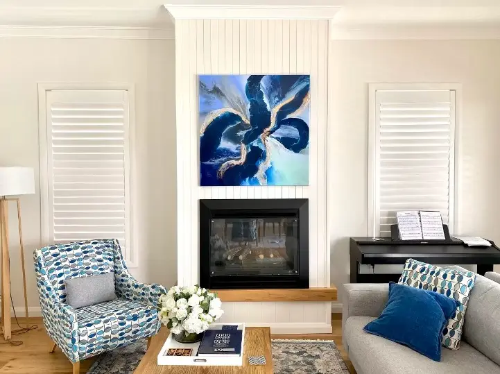
- Over a 2.4–2.7m ceiling, aim for artwork that occupies roughly 60–75% of the width of the furniture beneath it.
- In open-plan Northern Beaches homes with 3m ceilings, a single 1.8m–2m wide piece can anchor a living zone beautifully.
- Consider sightlines. From the kitchen island or staircase landing, what do you see first?
- Plan for wall reinforcement if you’re hanging large canvases or framed works over 20kg. This is especially relevant if you’re installing into plasterboard over steel framing.
- Lighting matters. A recessed wall washer or picture light needs to be roughed in before plastering.
Application
Before purchasing anything, measure the wall and sketch it to scale. Even better, have your designer drop placeholder artwork into your 3D model during documentation. That one move can prevent thousands of dollars in regret.
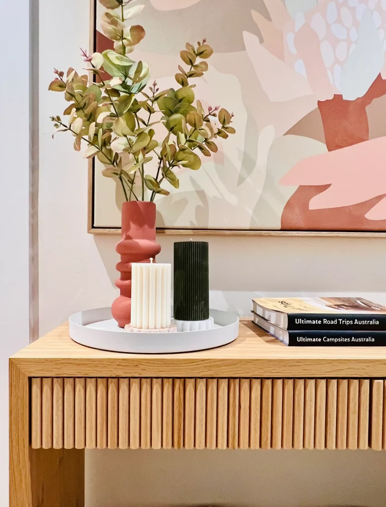
How to Match Artwork to Your Home’s Materials and Finishes
Insight
In a well-designed home, finishes already carry visual weight. Verde Alpi marble, honed limestone, brushed brass, timber veneer. Art shouldn’t repeat these materials exactly, but it should converse with them.
What most people miss is undertone. A “white” painting can clash against warm limestone. A cool-toned photograph can flatten a room filled with walnut.
Specifics
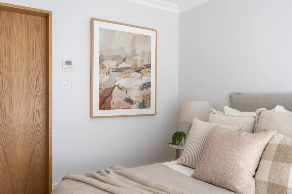
- In coastal Manly homes with oak flooring and off-white walls, linen canvases or textured plaster works tend to sit comfortably.
- If you have strong veining in stone, consider simpler artwork with restrained movement. Too much pattern-on-pattern creates visual noise.
- Frame choice matters in a luxury home. Thin shadow box frames in oak or blackened steel often feel more considered than generic white frames.
- Consider glazing. Museum glass reduces reflection, which is important in bright Northern Beaches homes with strong afternoon sun.
Application
Lay samples together. Physically place a swatch of your timber veneer next to a print sample. Notice the undertones. If they fight each other, trust that instinct.
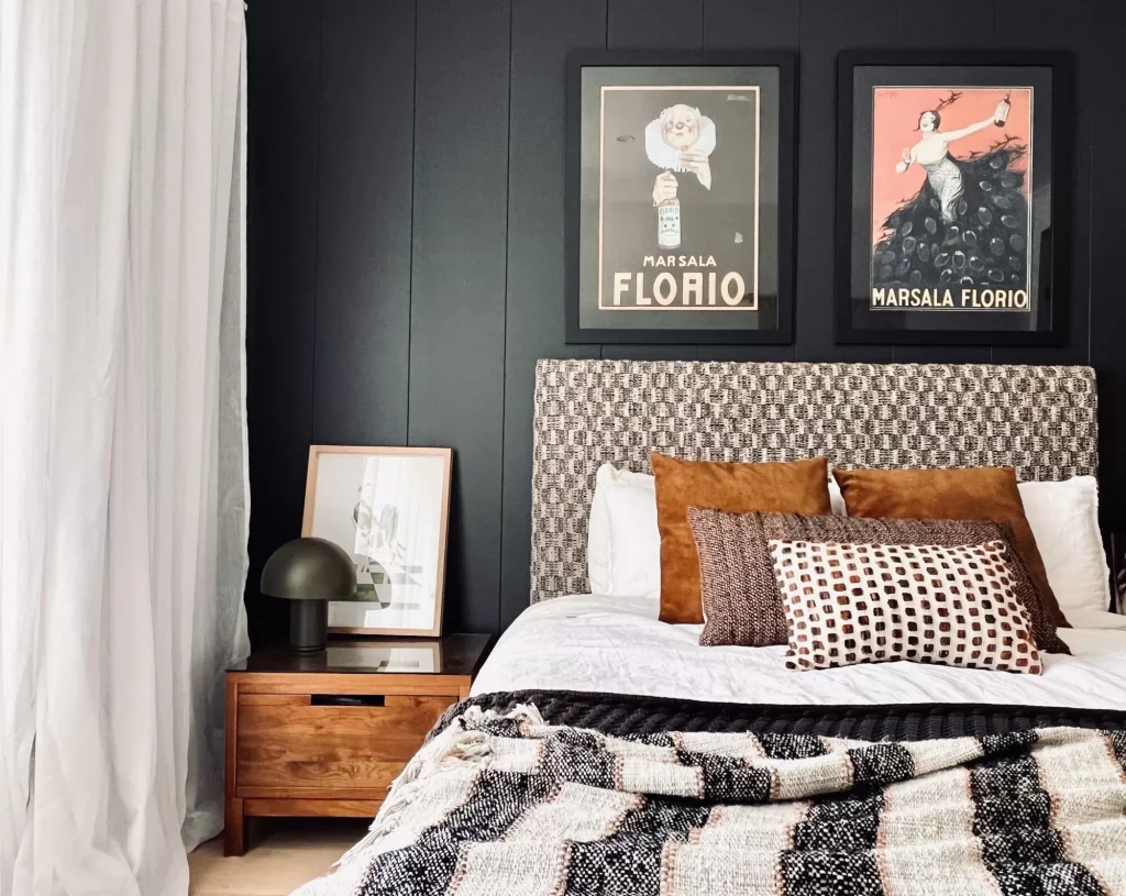
When a Gallery Wall Makes Sense
Insight
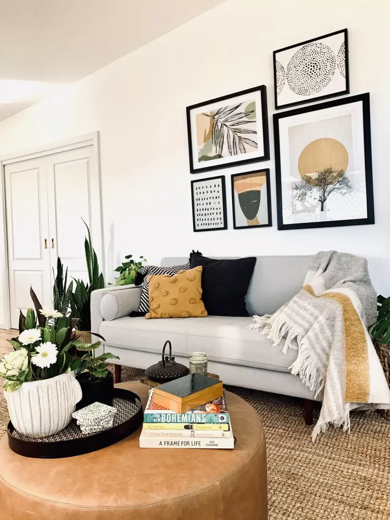
Gallery walls can be brilliant. They can also look chaotic very quickly. The mistake isn’t doing one. It’s treating it as a collection of random frames rather than a designed composition.
In a well considered home, a gallery wall should still feel intentional. It works best when there’s a clear grid, consistent framing strategy, or a defined theme tying the pieces together.
Specifics
- Keep a consistent frame colour or material to avoid visual clutter. Oak, black, or thin brass frames are often safest.
- Test layouts on the floor first, maintaining even spacing, typically 40–60mm between frames.
- Consider height. The centre of the composition should sit roughly at eye level, around 145–155cm from floor to midpoint.
- Think about backing. In stairwells or double-height voids, ensure fixings are appropriate for load and accessibility for future changes.
Application
Gallery walls work beautifully in transitional spaces such as staircases, hallways, or family rooms where storytelling adds warmth. They are less suited to highly formal living rooms where calm, large-scale art may be more appropriate.If you’re considering this approach, we’ve shared a step-by-step guide in our blog on how to hang a gallery wall, including layout strategies and common mistakes to avoid.
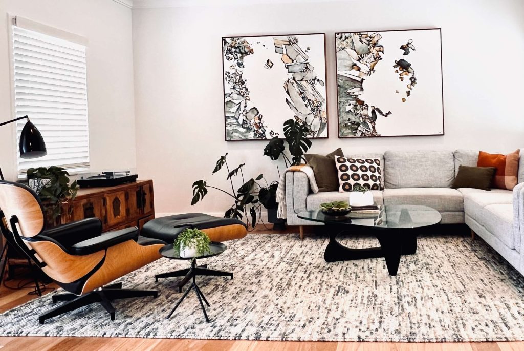
Should the Art Be the Focal Point or Support the Room?
Insight
Is the artwork the hero, or is it supporting the architecture? This is where interior decoration becomes strategic.
In some high end homes, art is the focal point. In others, it’s a quiet layer that allows the view, the joinery, or the fireplace to lead. Getting clear on this early makes the rest of the decision much easier.
Specifics
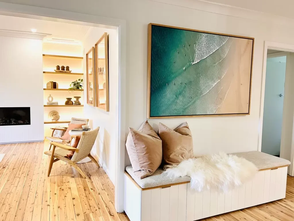
- Hero art works best in simpler rooms with controlled colour palettes.
- Supporting art suits rooms with strong architectural features such as curved staircases, detailed panelling, or bespoke joinery.
- Budget allocation should reflect this. If art is the hero in your living room, invest there and be lighter-touch in secondary bedrooms.
- Plan sequencing. In full-service renovations, we often specify art allowances early so scale is factored into electrical and joinery planning.
Application
Ask yourself: what do I want to notice first? The view? The fireplace? The art? Your answer shapes everything else.
How to Choose Artwork That Will Still Feel Right in Five or Ten Years
Insight
Trends in art move faster than architecture. A renovation should last 15–20 years. Your art doesn’t need to last forever, but it should feel connected to your taste rather than a passing trend.
What most people regret is buying something purely because it “matches” the sofa.
Specifics
- Invest in pieces that resonate personally. Commissioned works can be ideal if you want scale and palette alignment.
- Consider resale and insurance. Valuable works should be itemised and insured appropriately.
- Rotate art seasonally in secondary spaces if you enjoy variety. Keep key pieces stable in main living zones.
- Think about future flexibility. If you plan to sell in five years, neutral large-scale art tends to appeal broadly in a luxury home.
Application
Before purchasing, sit with the image for a week. If you still feel drawn to it without the pressure of the moment, it’s likely right.
My step by step process to choose art
Here’s the step-by-step process I use with a client who wants confidence and zero decision fatigue:
- Choose the wall first (not the artwork). Where do you want a focal point?
- Measure properly and set your size range.
- Pick the mood (calm / energetic / moody / fresh).
- Pick one colour rule (tonal, contrast, or bridging).
- Shortlist 5–10 pieces max (more than that and you’ll stop being able to tell what you like).
- Check lighting (natural light, glare, night-time lamps).
- Buy the hero piece first, then add supporting pieces later.
Art is meant to make your home feel more like you – not like a perfect catalogue. If it moves you, if you keep coming back to it, if it makes the room feel settled… that’s usually your answer.
FAQs: Choosing Art for Your Home
How do I choose art for my home if I don’t know my style?
Start with rooms you already like (even hotels, restaurants, or a friend’s home). Notice why you like them – calm colours, bold contrast, lots of texture, minimal frames. Then choose art based on that feeling rather than trying to name a style.
Should art match the room exactly?
No. Art should relate to the room, but it doesn’t need to match every colour or finish exactly. Often, a little contrast gives the space more depth.
Is it better to buy one large piece or multiple smaller pieces?
Usually, yes – if your goal is a calm, polished look. One large piece is often easier to place well, while multiple smaller pieces need more planning around spacing, framing, and composition.
How high should I hang artwork?
A common rule: place the centre of the artwork around eye level (roughly 145–155cm from the floor). If it’s above furniture, keep it visually connected and don’t float it too high.
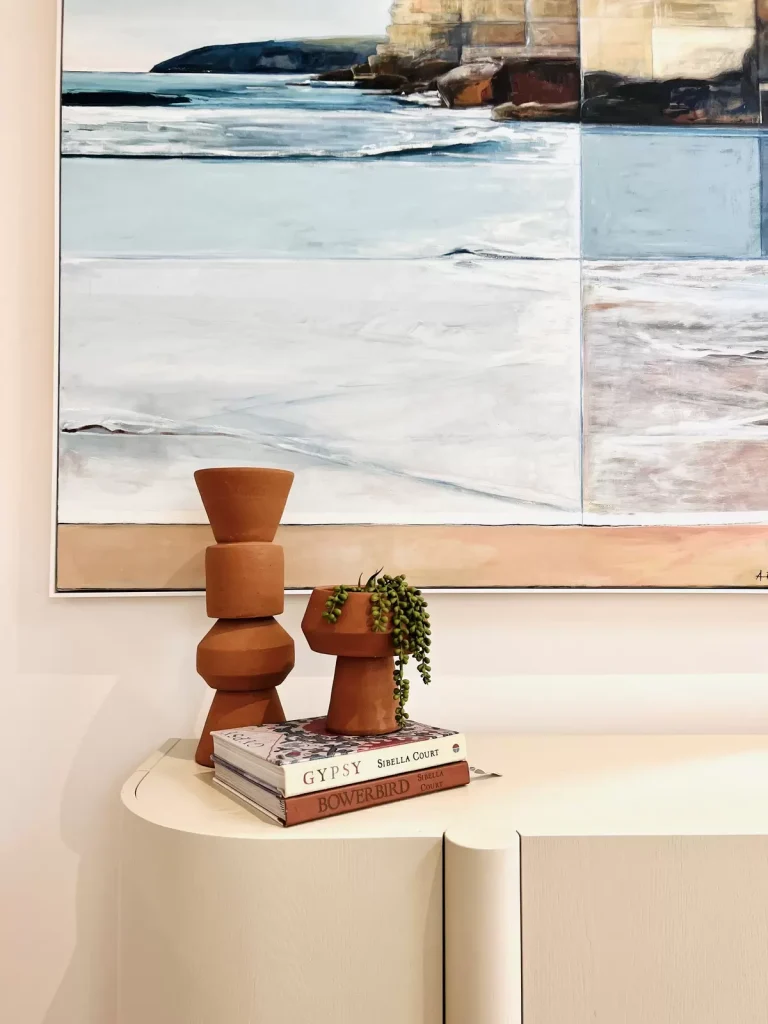
What type of art works best in a coastal home without looking too beachy?
Look for softness, texture, and natural tonal variation. Abstracts, landscapes, plaster works, and restrained photography usually feel more timeless than literal coastal motifs.
Where should I invest in original art, and where can I use prints?
Invest in originals where you spend the most time (main living area, entry). Use prints and photography in supporting spaces like hallways, bedrooms, studies, and guest rooms.
What if I love a piece but it doesn’t “go”?
If you truly love it, it probably belongs somewhere in your home – you may just need the right wall, scale, or frame. Try placing it in a calmer space, or reframing it to suit your finishes.
Wrap-Up
If you’re renovating or refining a home on Sydney’s Northern Beaches or North Shore, choosing art early can make the entire interior feel more resolved. At Orli Interiors, we help clients consider artwork alongside joinery, finishes, lighting, and furniture so the final result feels calm, cohesive, and personal.
Book a consultation if you’d like guidance as part of your broader design strategy.