


How to Choose Paint Colours Like a Designer: A Guide for Northern Beaches Home Owners
When it comes to creating a home that feels elevated yet deeply personal, choosing the right paint colours is one of the most important decisions you’ll make. And while a trip to the hardware store might make it seem as easy as picking a few swatches, any designer (or homeowner who’s had to repaint) will tell you—this decision deserves thought, context, and a little restraint.
At Orli Interiors, we believe your walls should do more than just sit quietly in the background—they should create atmosphere, enhance light, and feel effortlessly cohesive with your architecture, your furniture, and your lifestyle. Whether you’re styling a new build in Freshwater, renovating a Federation home in Manly, or refreshing a beachside apartment in Collaroy, here’s how to choose the right paint colour with confidence.

How Do I Pick the Right Paint Colour?
Here’s the short answer: Start with how you want the space to feel, then work backwards from there.
The long answer? Choosing paint colours isn’t just about preference—it’s about creating harmony between natural light, architecture, furniture, and the lifestyle you want to live in that room. Below are the three core principles we use at Orli Interiors when guiding our clients on colour selection:
1. Understand the Light First, Then the Colour
Most Northern Beaches homes are blessed with a lot of natural light—but the quality and orientation of that light will change everything about how a colour looks. A crisp white might look bright and clean in a north-facing living room in Balgowlah, but fall flat and grey in a shaded south-facing bedroom in Seaforth.
Orli Tip: Before committing, test large painted samples on your actual wall. Look at them at different times of day—morning, midday, and late afternoon—over at least 48 hours.
2. Consider Your Architectural Style
Are you working with coastal contemporary, mid-century, or a more traditional weatherboard aesthetic? The best paint choices support your architecture, not fight against it. For example:
- Classic Federation or Californian bungalows look timeless in warm whites, soft greens, and muted neutrals.
- Contemporary coastal homes can carry off bone whites, soft greys, or rich tonal blues that echo the sea.
- Minimalist apartments benefit from tonal layering of whites or warm greige with subtle contrast in trims and ceilings.
3. Think in Tones, Not Just Colours
A common mistake is choosing a colour in isolation. Instead, ask: What undertone is this colour carrying? Is it warm or cool? Will it sit comfortably with my flooring, benchtops, and upholstery?
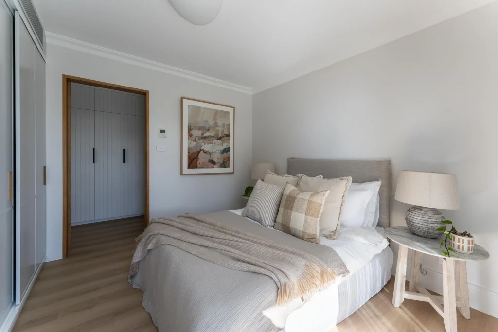
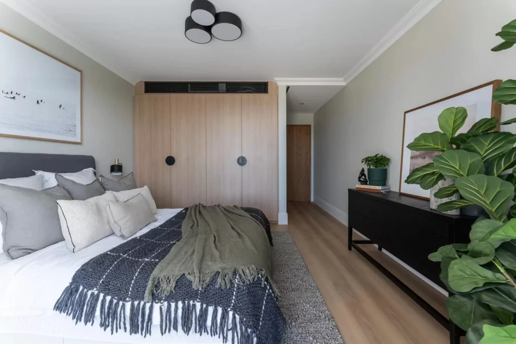
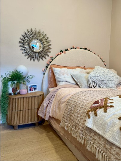
Warm whites (with yellow or pink undertones) feel soft and enveloping, perfect for creating a sense of intimacy. Cool whites (with grey or blue undertones) feel fresher and more architectural—ideal for a sleek, minimal look. Neutrals with green undertones often feel the most adaptable in Northern Beaches light, especially when paired with timber, stone, or greenery.
What is the Rule for Wall Colours?
There are several ‘rules’—but the most useful one? Keep your base colour consistent and introduce variation through depth, finish, and subtle contrast.
Here are a few designer-approved principles we follow:
1. One Base Colour, Multiple Applications
To create flow throughout your home, select one base colour and adjust its intensity depending on the room. Use the full-strength version in living zones, half-strength in hallways, and quarter-strength in bedrooms. This creates a seamless sense of calm and cohesion.
2. Use Contrast Carefully
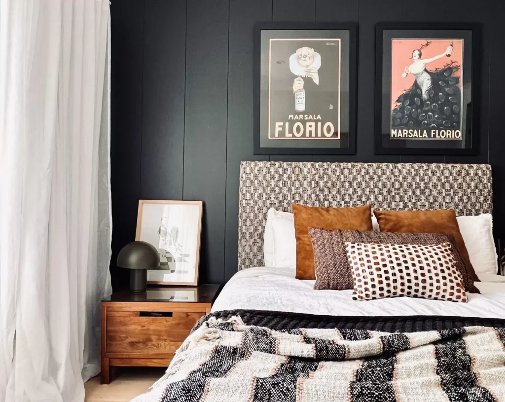
If you want to introduce contrast—say, a feature wall or darker cabinetry—it works best when it relates to something else in the space. A navy blue feature wall in a room with ocean views? Perfection. The same wall in a windowless hallway? Likely too heavy. Choose contrast where it makes spatial or emotional sense.
3. Choose the Right Paint Finish
Don’t underestimate the power of finish. Here’s a quick guide:
- Flat/Matt: Best for ceilings and adult bedrooms—low sheen, hides imperfections.
- Low-Sheen/Velvet: The go-to for most interior walls—elegant and forgiving.
- Satin/Semi-Gloss: Ideal for trims, doors, and joinery.
- Gloss: Used sparingly in heritage detailing or dramatic modern cabinetry.
Bonus Tip: In high-traffic family areas like the kitchen or hallway, opt for a washable low-sheen finish like Dulux Wash&Wear—it will keep your walls looking fresh with far less effort.
Advanced Considerations for a Northern Beaches Home
If you’re aiming for true sophistication, go beyond the paint chart. Here’s where deeper thinking can take your colour decisions to the next level:
1. The Outdoor Connection
Homes on the Northern Beaches often blur the lines between indoors and outdoors. Your wall colour should complement—not compete with—what’s happening just outside your windows. For example, a soft eucalypt green or muted taupe can echo the gum trees and sandstone seen from your living room.
2. Mood and Purpose
A family media room in Newport might call for a deep, cocooning tone like Dulux ‘Mangaweka’ or Porter’s ‘Black Cockatoo’ to enhance intimacy and sound absorption. A north-facing studio in Fairlight, however, might need a calming white with warm undertones to encourage creativity and calm.
3. Don’t Skip the Ceiling
Your ceiling is the fifth wall. Don’t default to generic ceiling white—consider matching it to your wall colour at quarter strength for softness and cohesion, or use a slightly darker tone to create intimacy in larger spaces.
Colour Drenching: Bold, Immersive, and Intentional
One of the most striking trends in contemporary interiors is colour drenching—where a single shade is used across walls, ceilings, and even trims or cabinetry. Far from feeling overwhelming, this approach can create a deeply cohesive and cocooning effect. It works especially well in smaller rooms like home offices, powder rooms, or bedrooms, where the lack of contrast gives a soothing, enveloping atmosphere.
To do it well:
- Choose a hue that’s rich but not overpowering—think earthy ochres, muted eucalyptus greens, or soft clay pinks
- Pair with tonal furnishings and layered textures for depth
- Use matte or low-sheen finishes to enhance the sophistication of the look
Colour drenching isn’t about being loud—it’s about being confident in a unified, expressive palette.
Painted Skirtings & Trims: A Subtle Twist on Tradition
If you’re craving a little personality but don’t want to commit to an entirely coloured room, consider painting your skirtings, architraves, doors or window trims in a contrasting or unexpected colour. Against classic white walls, a muted mustard, navy, or sage green can add a whisper of playfulness without overwhelming the space.
It’s a particularly clever strategy in:
- Children’s rooms or creative studios
- Transitional hallways or entryways
- Coastal homes that need a subtle point of difference
Tip: For a more contemporary look, paint the door and its trim the same colour—this simplifies the visual breaks and creates a clean silhouette.
Cabinetry Colour: Where Practicality Meets Personality
Joinery is one of the most high-touch, high-use elements of a home—and it’s often a missed opportunity for injecting character. While neutral cabinetry is timeless, adding colour in your kitchen, bathroom, or laundry joinery can elevate the room and reflect your personal style.
Smart ways to incorporate colour in cabinetry:
- Use soft colour-blocking: e.g., lower cabinets in muted olive or French grey, uppers in classic white
- Choose hues that complement nearby wall colours, tiles, or flooring
- Consider painted timber finishes for softness and texture
- Don’t overlook utility spaces—powder rooms and laundries are ideal places for bolder choices
Think of cabinetry colour as a design bridge—it should harmonise with the broader scheme but confidently stand on its own. The goal is character, not chaos.
Beyond Paint: Texture, Patina & Pattern
If you’re looking to move beyond standard paint finishes, there’s a growing appetite for decorative surfaces that bring tactile richness and visual nuance to a space—without relying solely on colour contrast. Finishes like limewash, microcement, and wallpaper are beautiful alternatives that add character, texture, and depth.
Limewash: Soft Patina & Timeless Charm
Limewashing is a centuries-old technique that’s found its way back into contemporary homes for good reason. It creates a soft, chalky finish with gentle movement—almost like a watercolour for your walls. The result is subtle texture, organic depth, and an elegant patina that evolves beautifully with light throughout the day.
Perfect for:
- Bedrooms and living spaces where softness and mood are desired
- Layering neutral tones without flatness
- Creating a romantic, lived-in feel without being rustic
Limewash looks especially striking in soft neutrals, warm greys, or earthy tones, and pairs beautifully with natural stone, oak flooring, or sheer linen curtains.
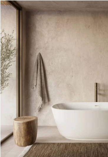
Microcement: Sculptural & Seamless
Microcement offers a smooth, continuous surface that feels architectural and clean, with a raw yet refined aesthetic. It’s incredibly versatile—equally at home in bathrooms, fireplaces, and kitchens—and works brilliantly when you want minimal visual clutter but maximum texture.
Best used in:
- Bathrooms or ensuites for a spa-like finish
- Fireplaces or feature walls to create a subtle focal point
- Kitchens or laundries where tiles feel too clinical
Choose soft, neutral tones like dove grey, putty, or sandstone to complement the layered finishes Orli Interiors is known for.
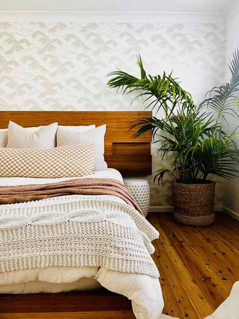
Wallpaper: Personality & Play in Print
Wallpaper is an easy and impactful way to introduce pattern, storytelling, or a sense of surprise. Today’s designs go far beyond florals, offering everything from large-scale botanicals and abstract murals to tactile grasscloths and architectural grids.
Great for:
- Powder rooms or entries where you want a dramatic moment
- Children’s bedrooms or studies where creativity is welcome
- Creating mood without needing strong colour
Wallpaper is also a great option if you want to inject character without introducing more furniture or decorative objects.
Final Thoughts: Colour is Personal, But Context is Everything
When clients ask us, “What’s the best white?”, the answer is always: It depends on your home, your light, and your lifestyle.
Having said that, our favourite warm white has for a long time been Dulux’s ‘Casper White’ whereas ‘Lexicon’ remains a staple for cool white homes. But don’t take our word for it – test those sample swatches!
Great design isn’t just about choosing beautiful things—it’s about choosing the right things for your home. That’s where we come in. At Orli Interiors, we guide our clients through the full design process, including tailored paint and colour selections that suit their architecture, their furnishings, and the way they want to live in their space.
Need Help Choosing Paint Colours?
If you’re building or renovating on Sydney’s Northern Beaches and want a home that feels effortlessly elegant, we’d love to help. Whether you’re after a full-service design experience or simply need help selecting the right finishes, get in touch to book a consultation.
Read more: The Best Kitchen & Bathroom Materials for a Timeless Look
Or explore: Our Services – to find the right solution for you.
